Calibre Conveyancing
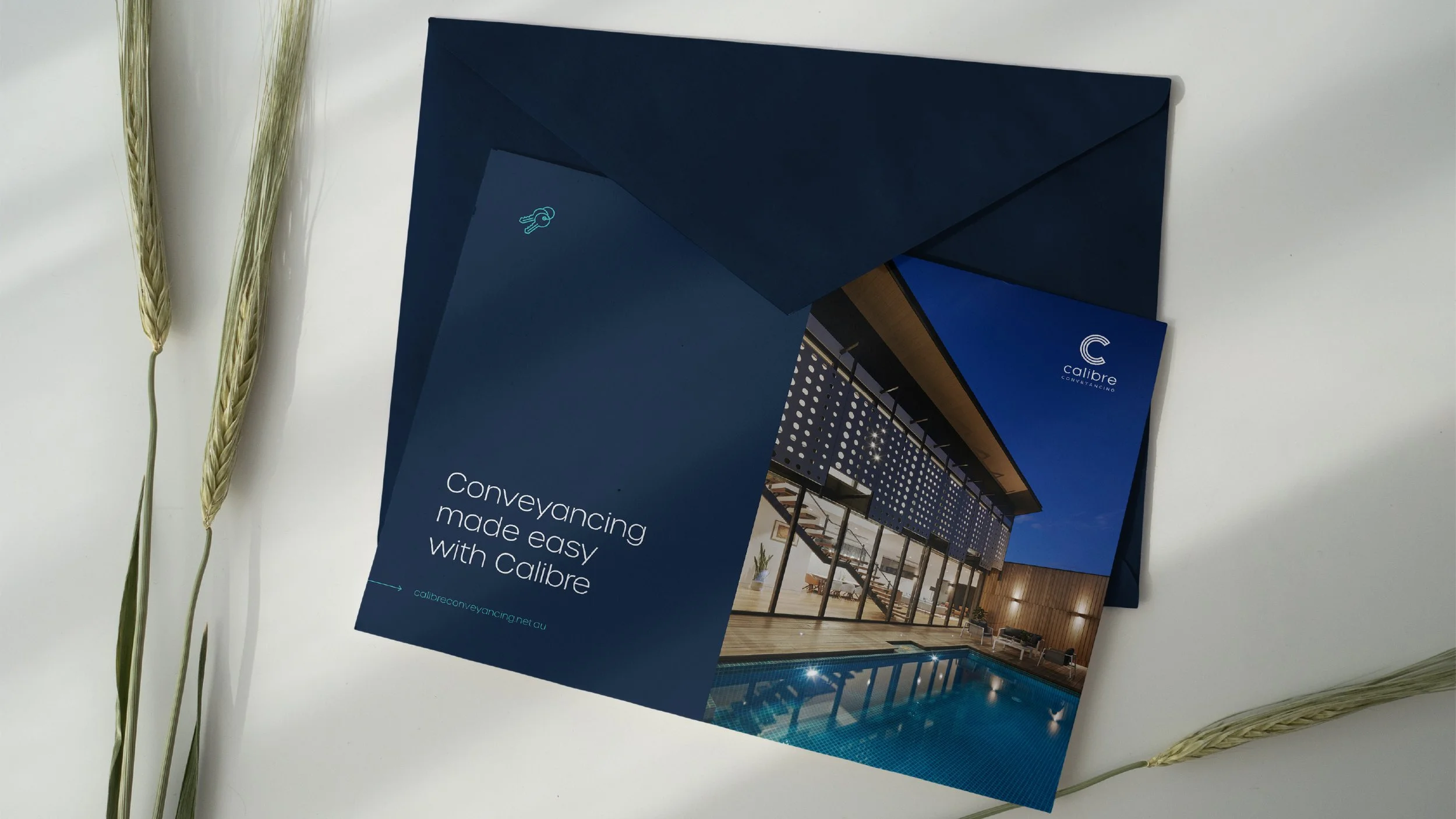
Calibre Conveyancing needed a brand that felt as sharp and reliable as the service they deliver. Clear, confident and built for trust.
Operating in the Queensland property market, their identity had to cut through the noise — approachable enough to ease a client's nerves, yet polished enough to command confidence at every transaction.
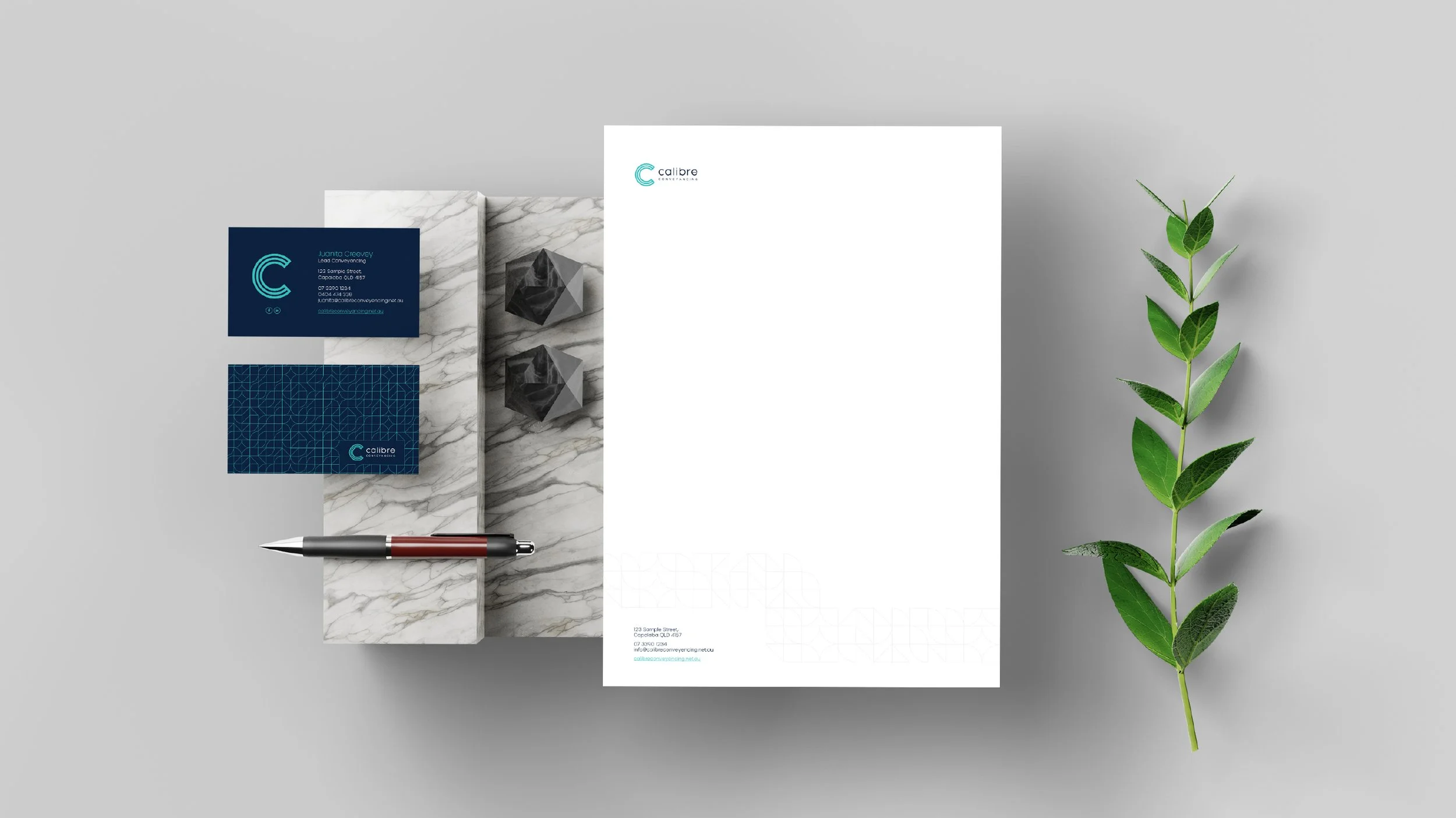
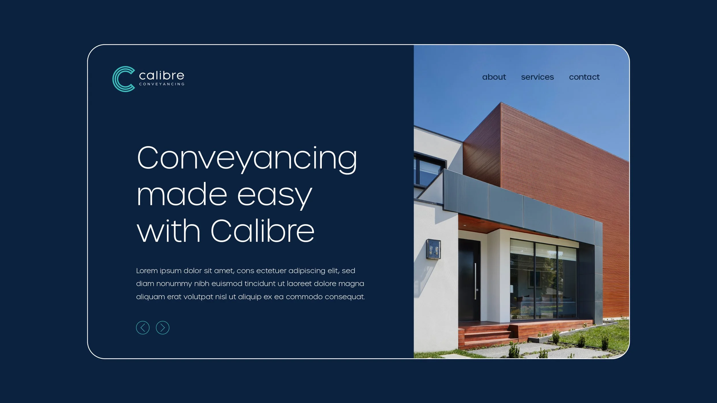
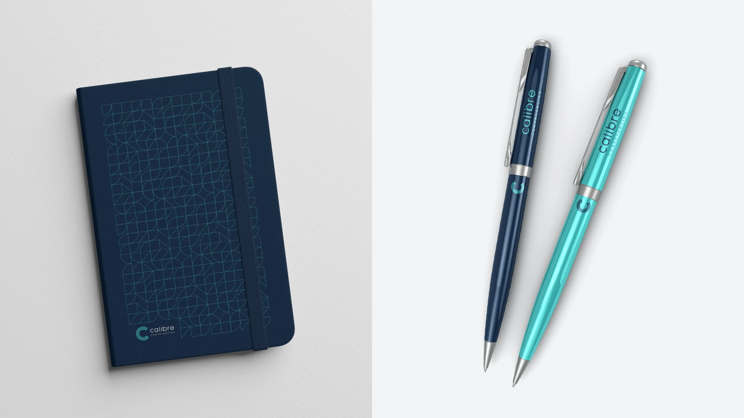
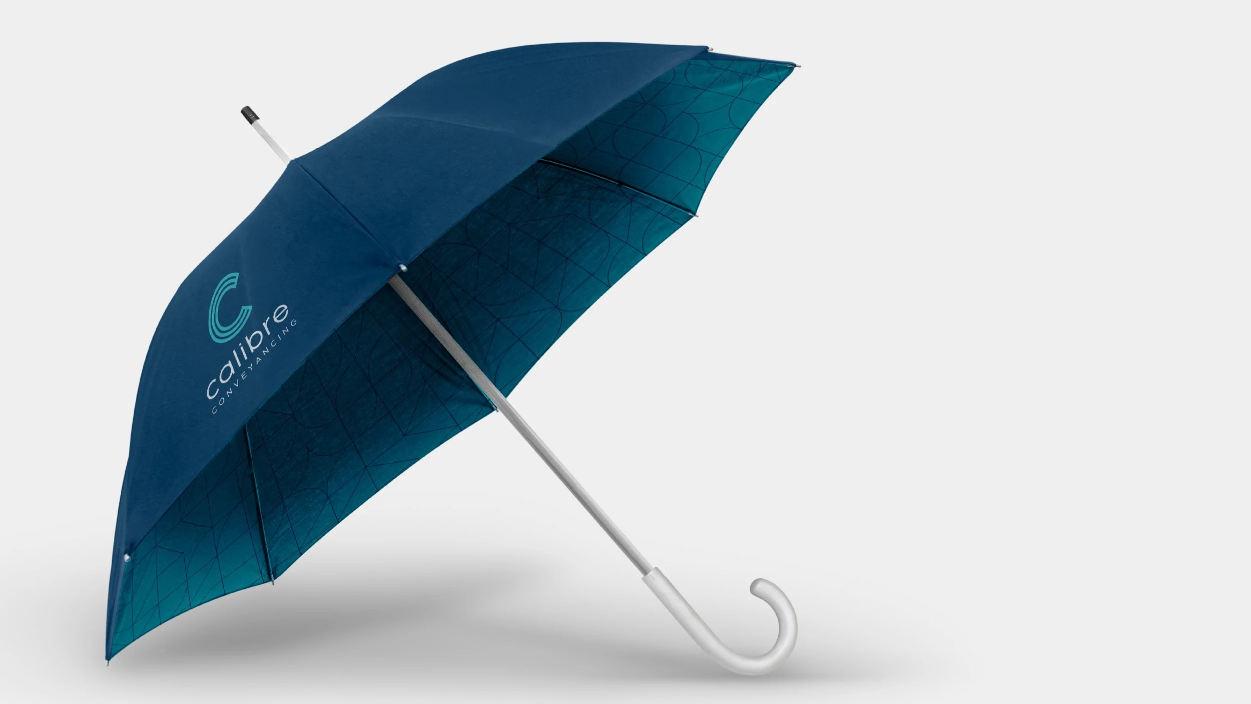
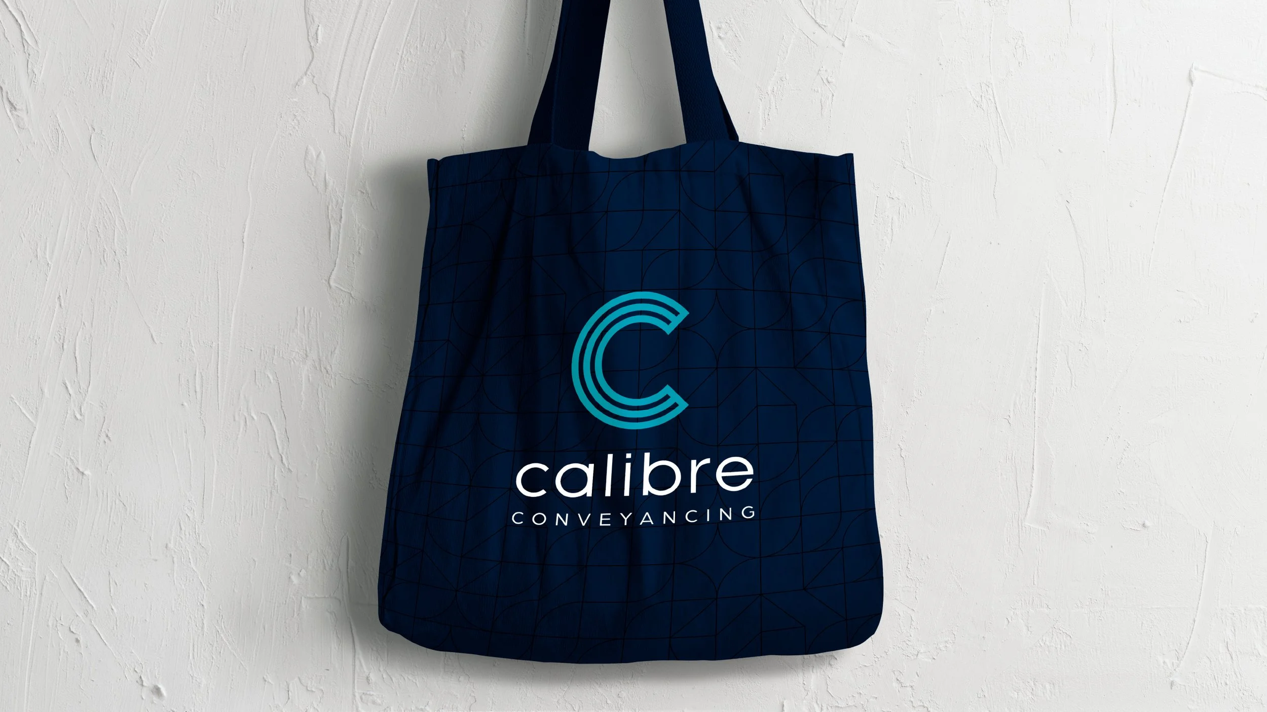
The new direction brings together a clean sans-serif typeface, a distinctive 'C' mark and a bright, fresh colour palette that signals clarity in an industry that can feel anything but. A supporting pattern extends the brand beyond the logo — giving it presence across every touchpoint, whether the mark is there or not.
A brand built to match the way Calibre works: efficient, professional and always in your corner.
Scope:
Brand Identity
Stationery
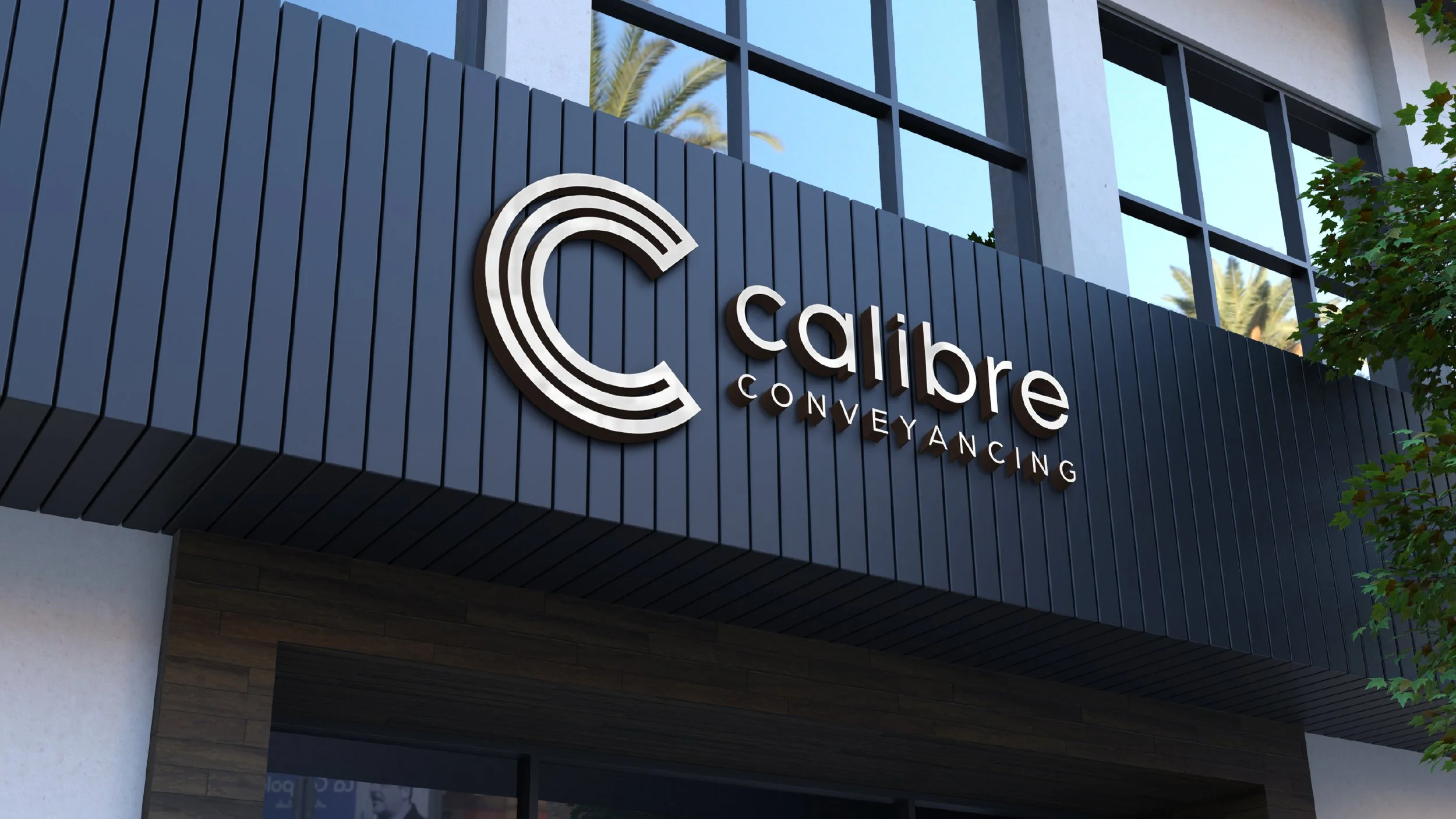
Signage