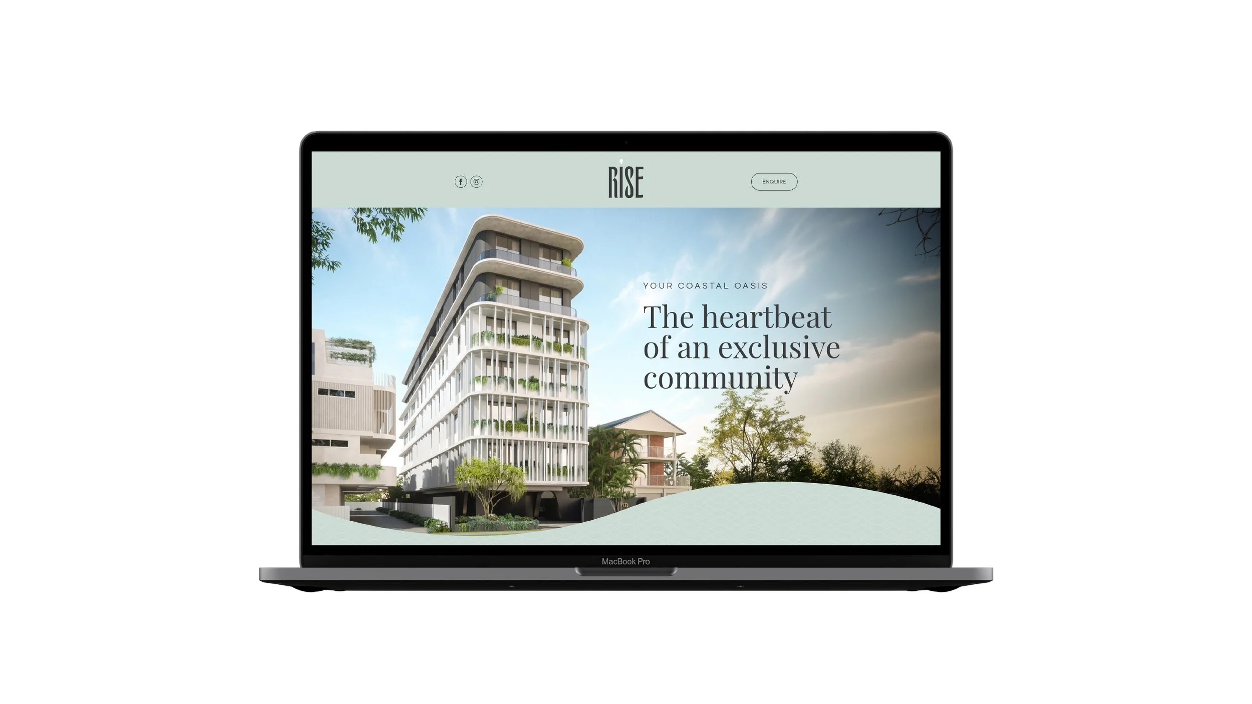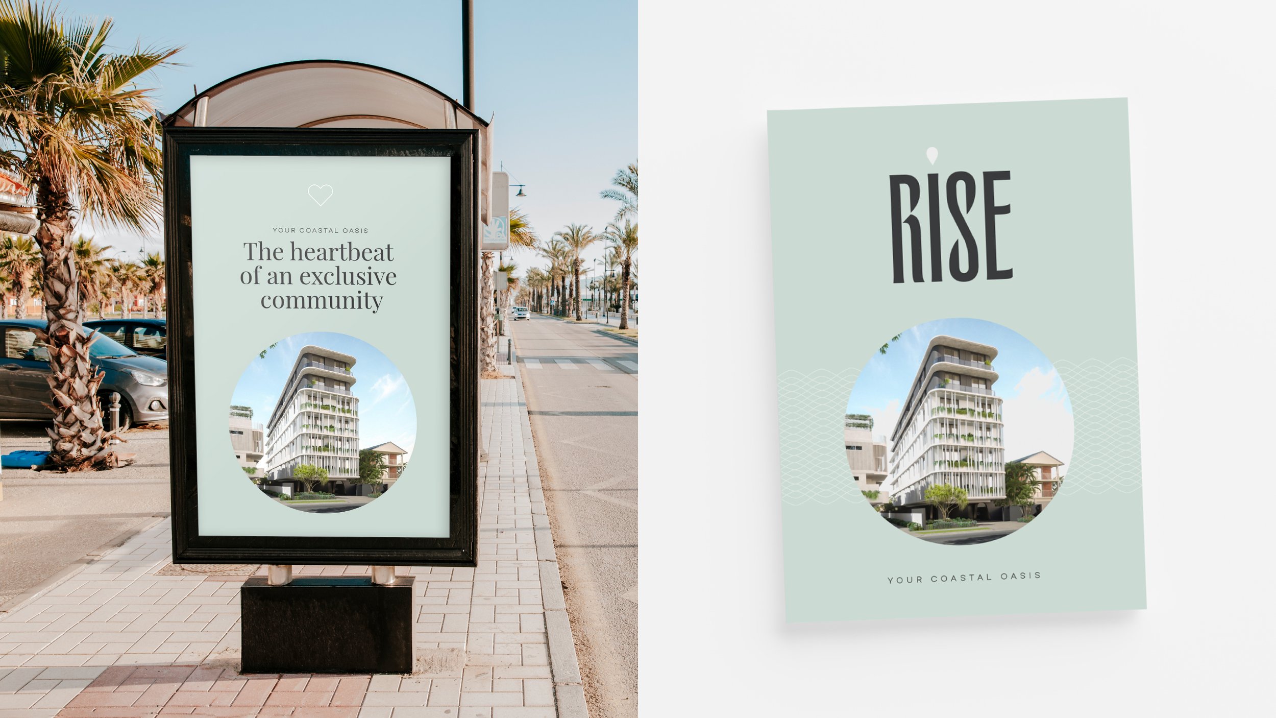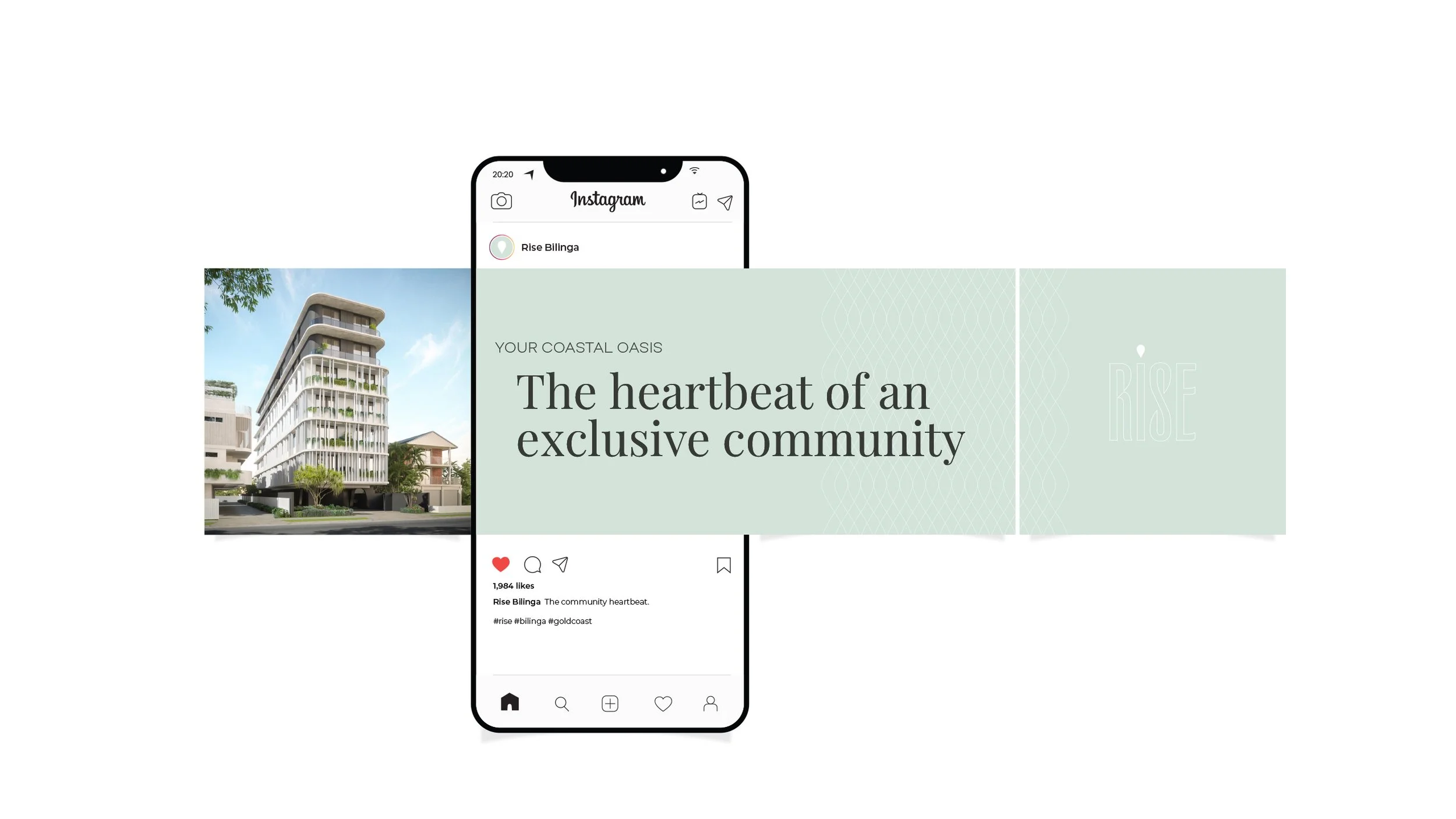
Rise (Bilinga)
7 Storey Development
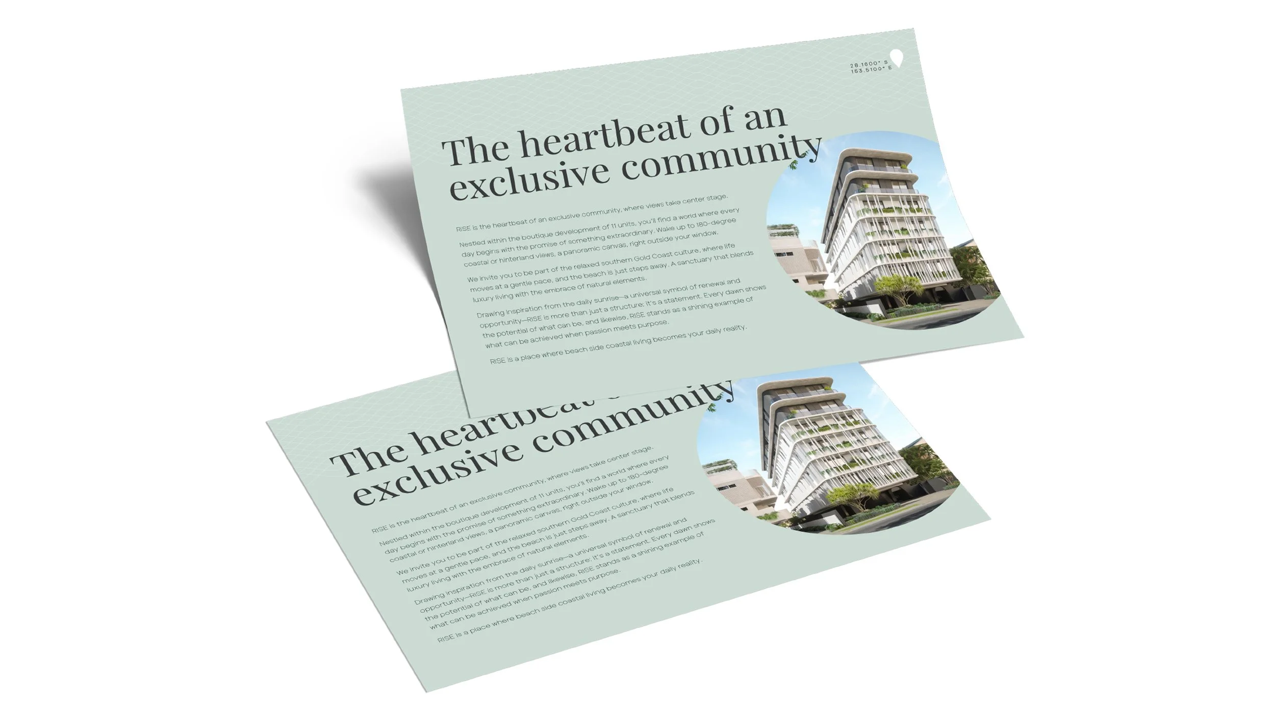
Rise Bilinga needed a brand that felt as considered as the community it represents. Refined, coastal and quietly confident.
Positioned steps from the beach in one of the southern Gold Coast's best-kept secrets, the identity had to carry the same effortless elegance as the development itself. Boutique in scale, but premium in every detail.
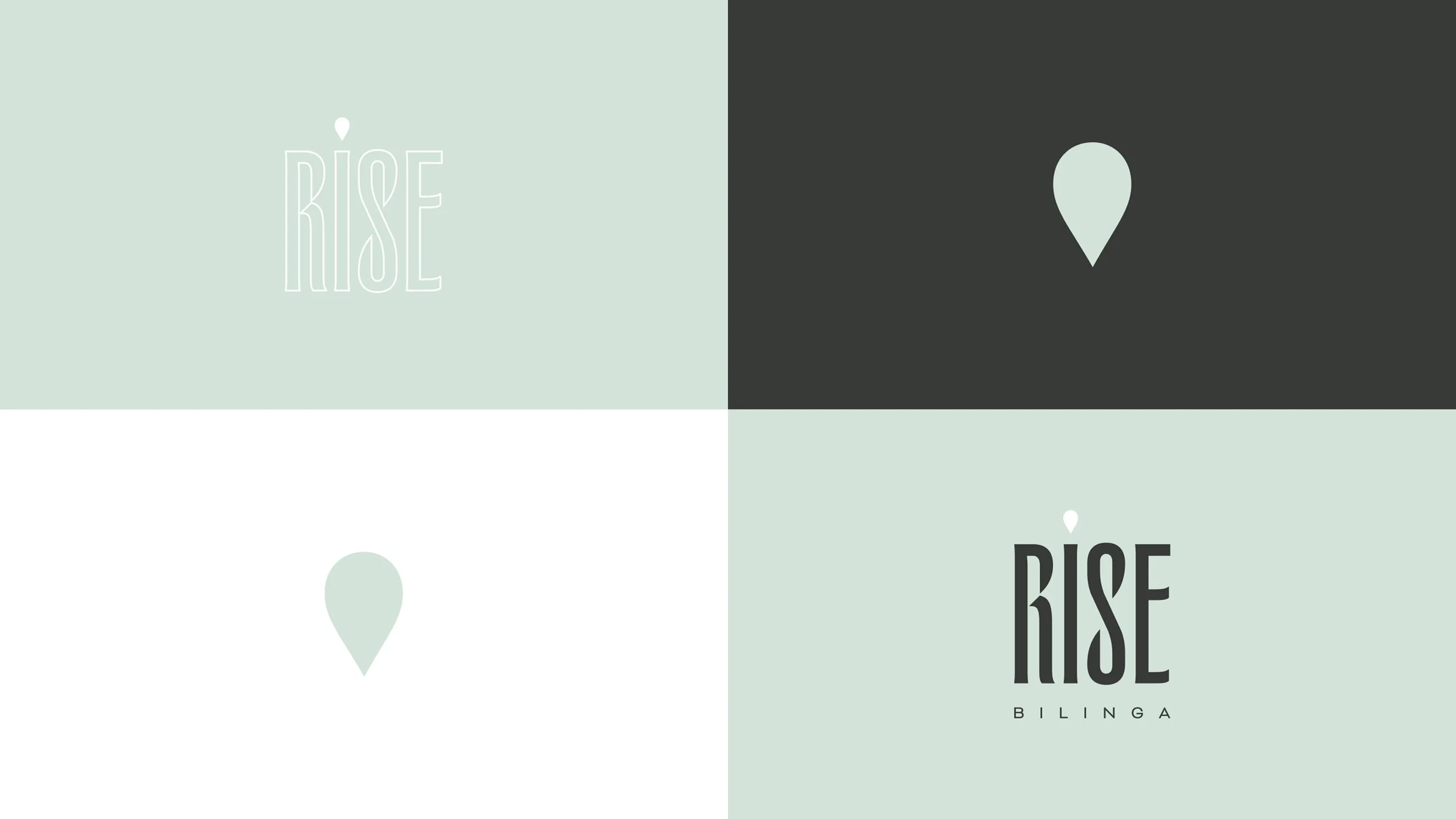
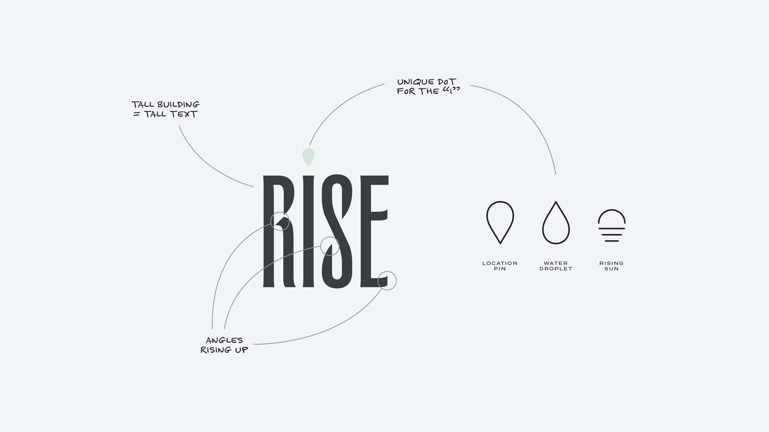
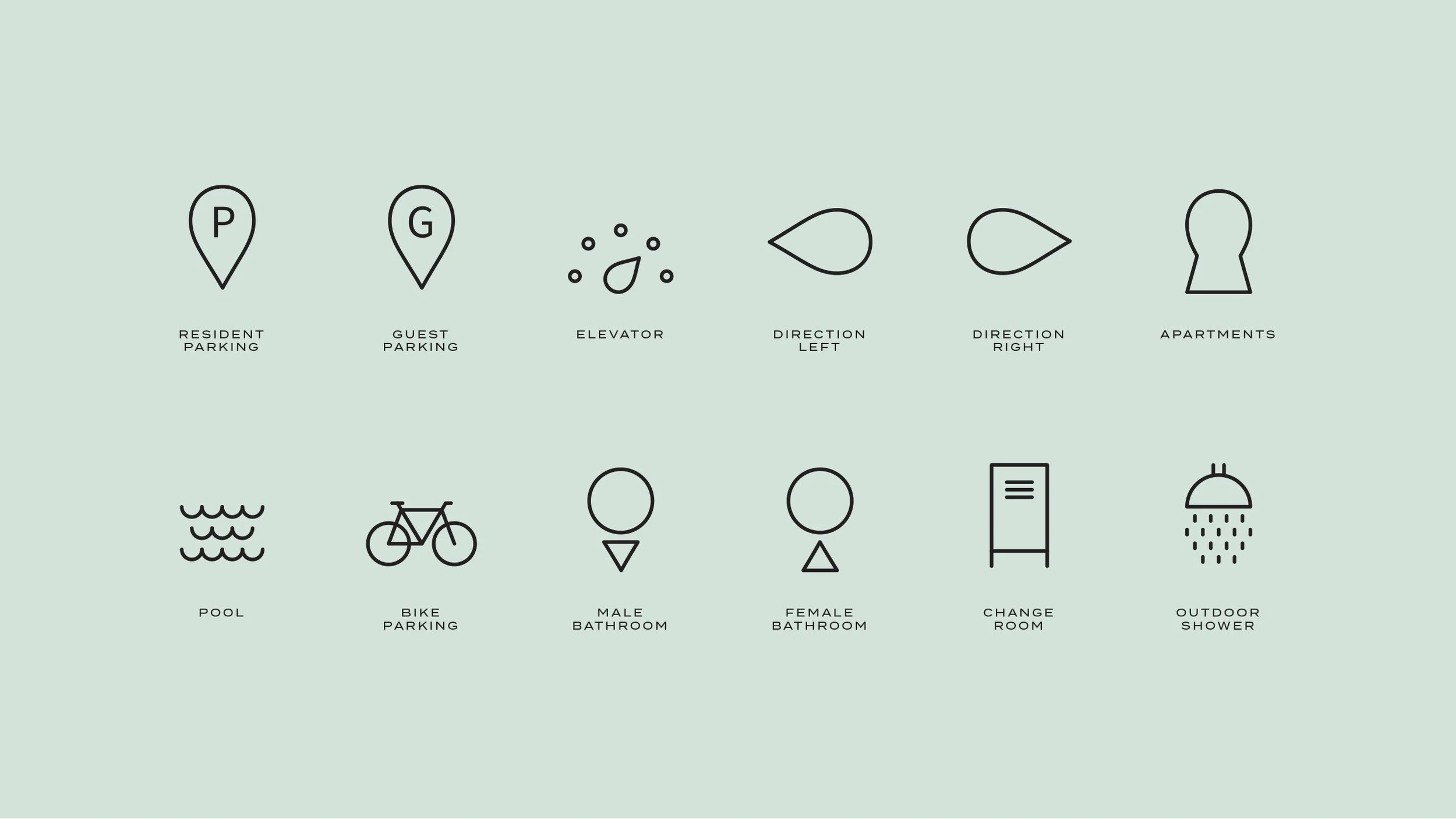
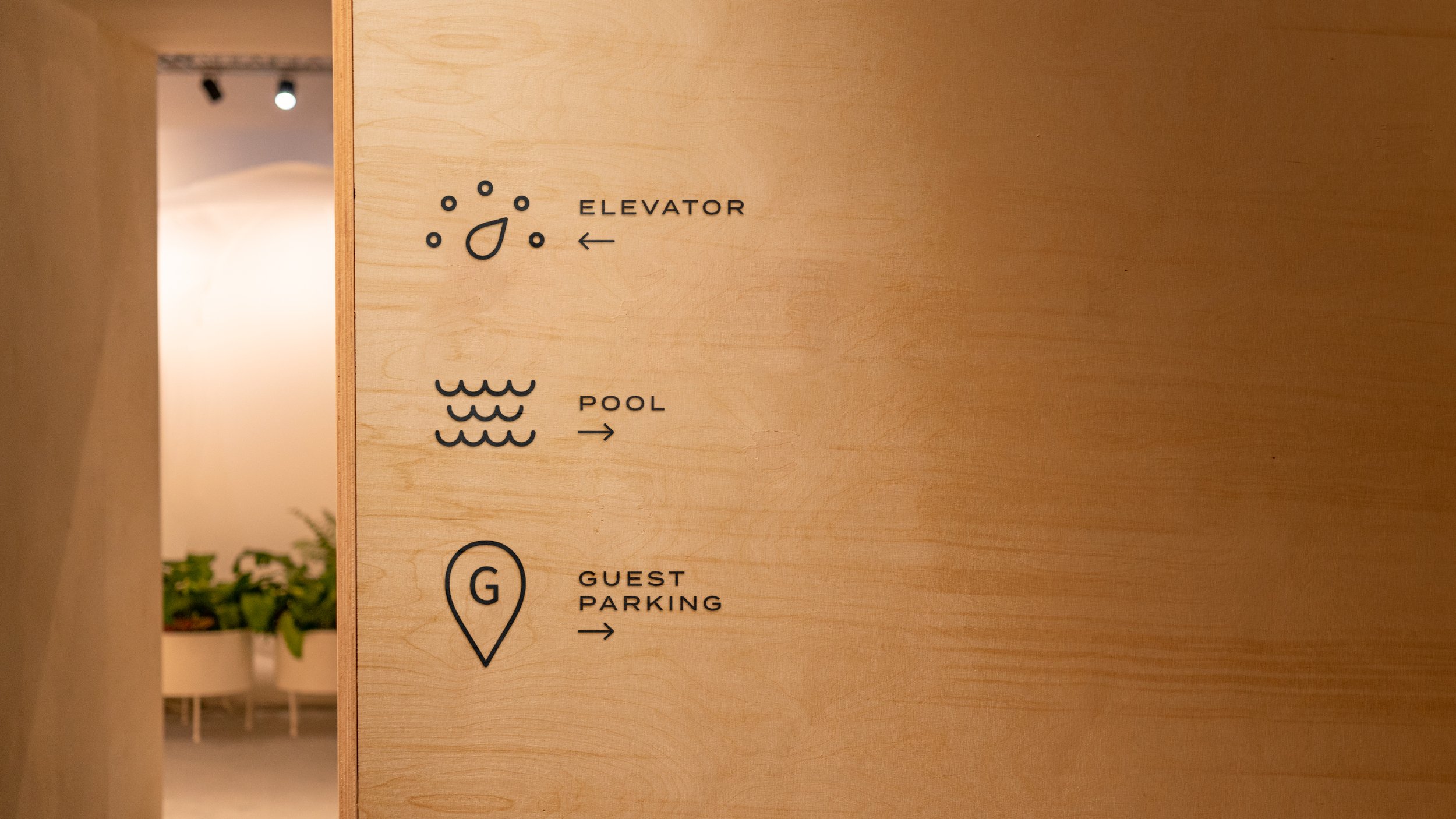
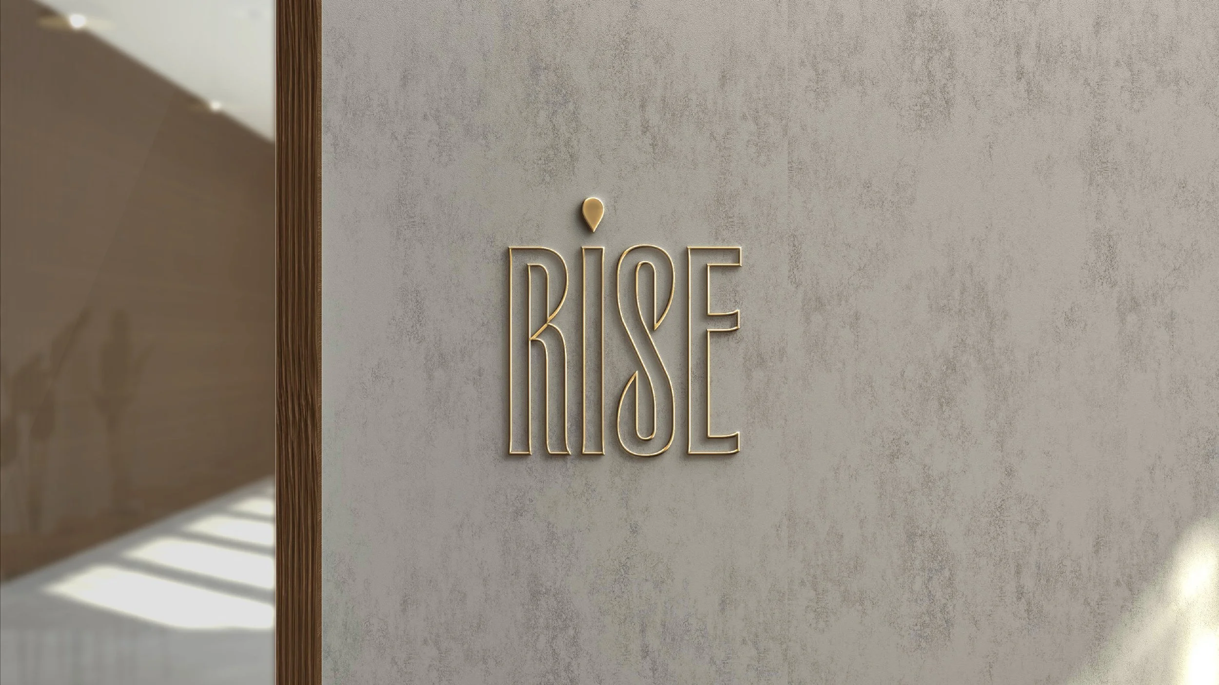
The wordmark draws from the architecture it represents — tall, editorial letterforms with a location pin replacing the dot on the 'i', grounding the brand to its place on the coast. An organic softness runs through every touchpoint, from the sage and shale palette to the minimal linework icons that guide residents through the building.
This is a brand that feels like the view from the penthouse. Calm, unhurried and unmistakably Gold Coast.
Scope:
Brand Identity
Signage
Social Media
Brochure
Billboards
Iconography