Skintellect
Skin Care Clinic
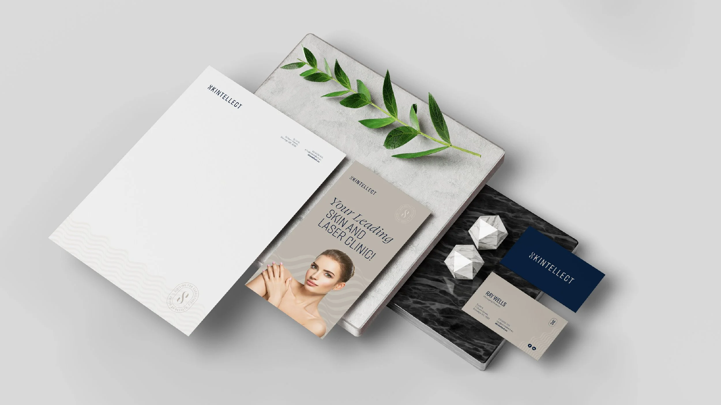
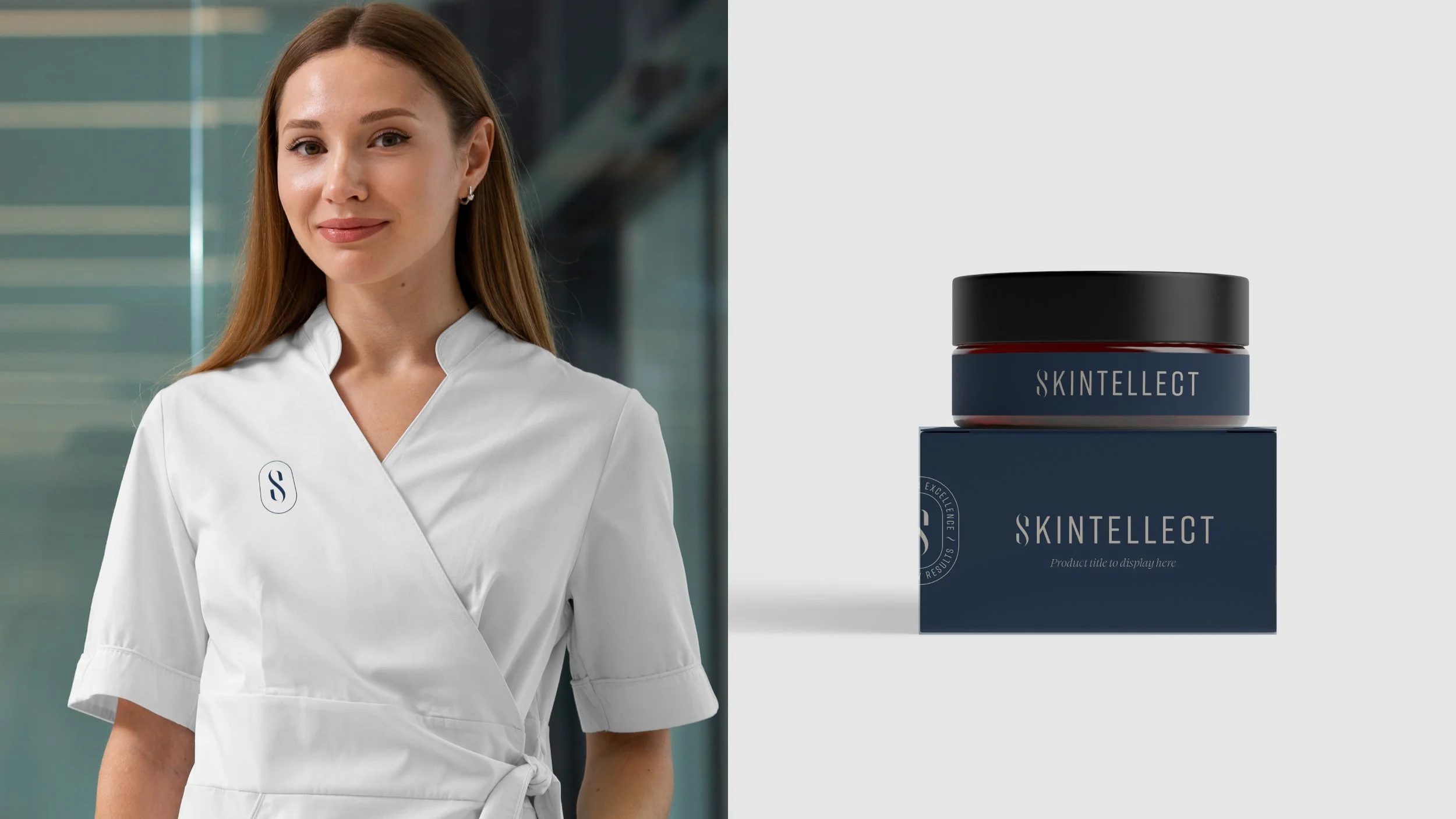
The new wordmark keeps things clean, fresh and elegant, built to match the calibre of a clinic that leads with real expertise. The standout detail sits in the S, subtly reworked into a DNA helix, a quiet nod to the previous brand and a clever tie back to the science behind the skin.
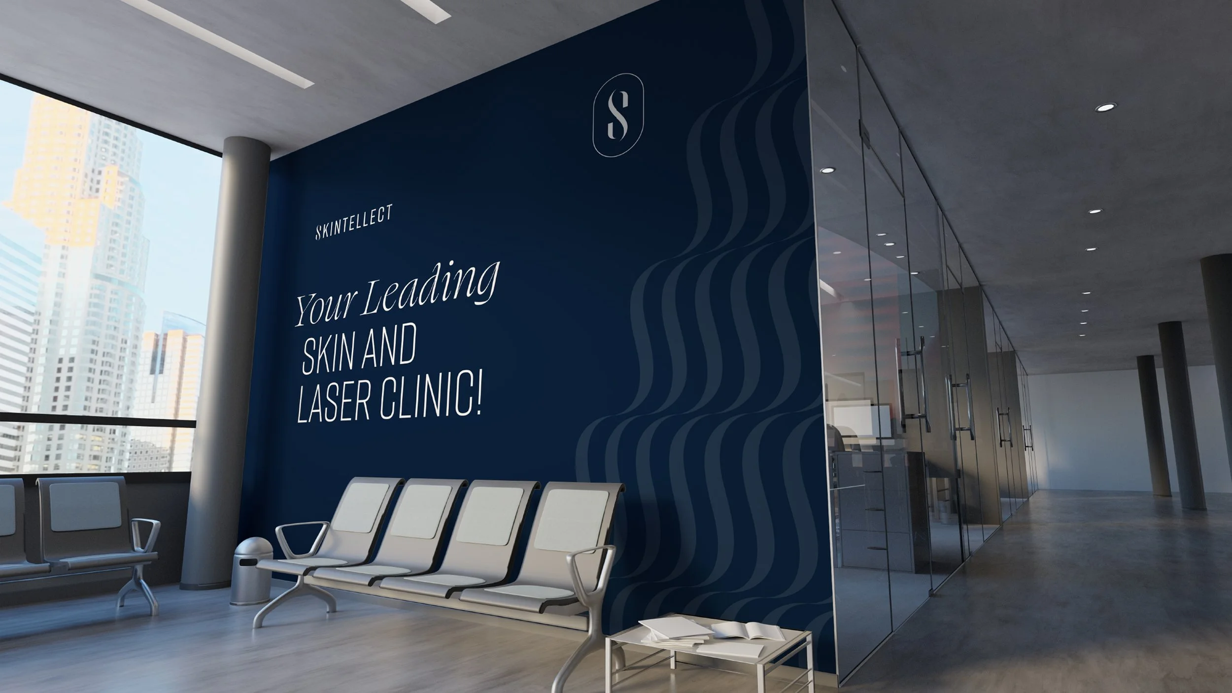
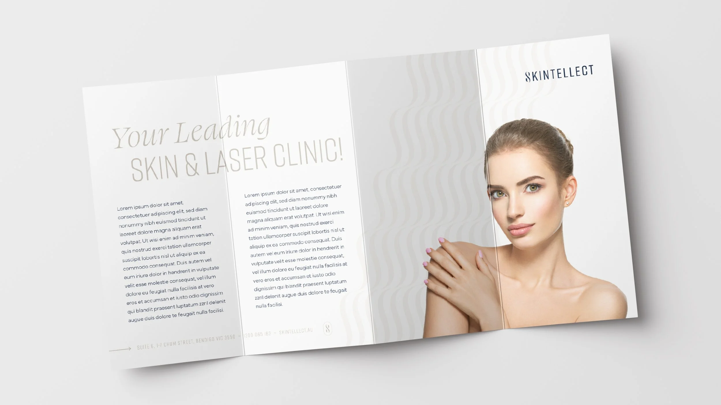
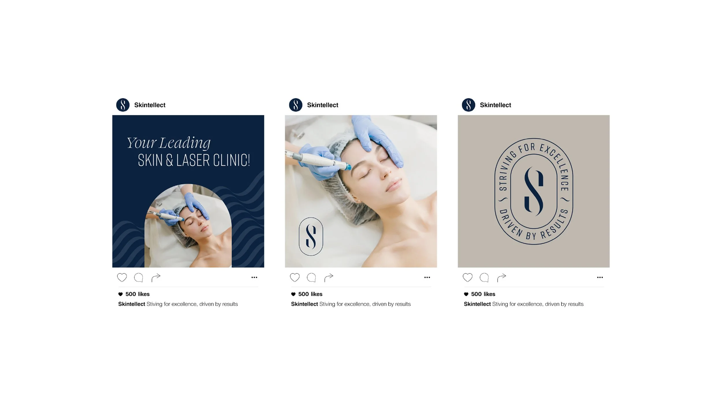
A flowing serif carries the wordmark, giving it a softer, more considered feel than the clinical look so many skin clinics fall into. It's paired with an elegant supporting pattern that extends the identity across every touchpoint, adding polish without ever feeling cold.
The palette of navy, silver and pewter does the heavy lifting here. It's a combination that feels right at home in the medical field, while still reading as premium and refined. Together, the colours and serif strike the balance Skintellect needed: credible enough for a clinical setting, elegant enough for a brand built on trust.
Scope:
Brand Identity
Stationery
Signage
Social Media Set-up